 SeekaHost.com Client Area
  SeekaHost.app
  SeekaHost.co.uk
  SeekaHost.in
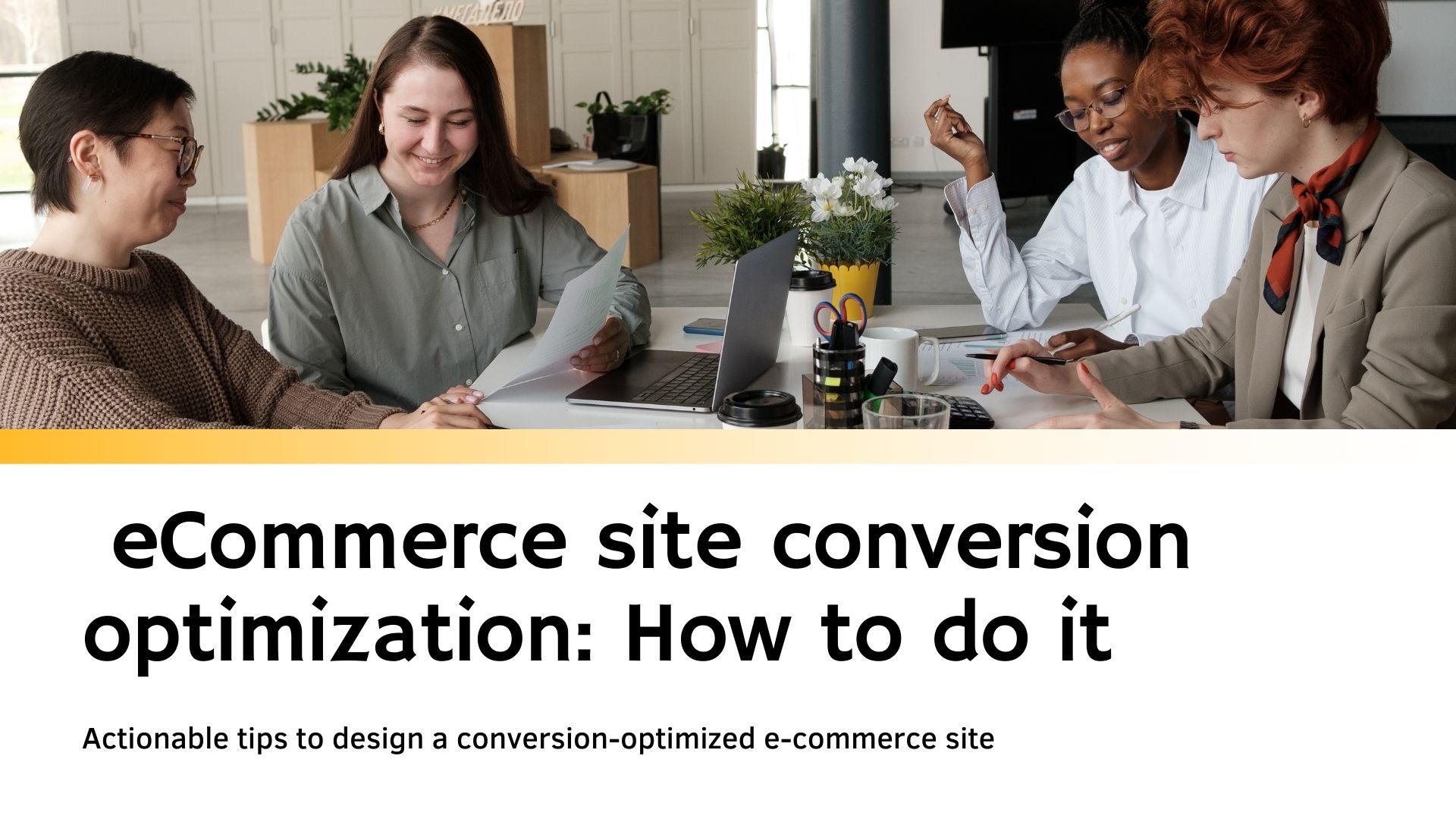
How to create a perfect conversion-optimized e-commerce site?

By Ryan Bradman
E-commerce has revolutionized shopping and made it a lot easier for shoppers to buy their favourite items at reasonable prices right from the comforts of their house.
It has also multiplied the selling opportunities for businesses. However, due to heavy competition in the field, one of the major concerns of e-commerce sites is how to increase the conversion rate. Your site’s design plays a vital role here.
In this post, we will mention some simple yet effective and actionable tips to design a conversion-optimized e-commerce site:
Design an appealing Homepage with user-friendly features
The homepage is the entry point for most of the shoppers so design it very carefully. It should offer a quick and clear idea about your brand, products, and UVP (Unique Value Proposition). Here’s how to achieve the most out of it:
- Use consumer psychology for primary brand-defining components like logo, images, colors, and taglines and create a synergy to deliver a quick message
- Use a short but impressive tagline that clearly and quickly defines your UVP. Translate your branding goals into power words that trigger feelings and curiosity
- Reduce redundancy and stop words like articles, prepositions, etc. Using AI tag/logo generating tools can help
- Avoid clipart. Separate the fonts and icon and don’t use too many objects as it clutters a logo
Make it easier for visitors to navigate your site
Sifting through menus, categories, and product lists can be tedious and distracting for shoppers. No one has the time or patience to struggle through lots of content or elements to find what they are exactly looking for. Here are a few ways you can help such time-pressed visitors through your guided structure:
- Add a search box in the upper pane to save their time and efforts
- Search options should show alternatives for unavailable products and offer logical recommendations. It saves you from losing sales. The search box should remain visible even while scrolling
- Include thumbnails representing prime categories and bigger images of the most popular products
- Highlight products with special deals and offer to prompt your visitors to act
Learn from the examples
AN easier way to start your digital marketing journey quickly and hassle-free is to learn from examples of popular websites. Here are a few real-life examples that can help you. Different businesses and industries need different benchmarks for designing ideal page layouts. However, you can refer to the product pages of globally reputed eCommerce sites and adopt the key characteristics from there.
Here are a few popular examples that can give you a clearer idea:
Do a complete scan of your customers’ personality
One thing to keep in mind is that your customers have a specific personality. While no two persons have the same personality traits, you may observe a in most cases that allows you to connect specific personality traits based on the product choices/preferences of your customers. So analyzing the personality traits of your customers allows you to touch multiple “points” of their personality that increases the chances of conversion or at least help your brand to make a deeper impact on customers’ minds.
For instance, let’s take people who like herbal and purely natural skincare/personal care products. Ideally a majority of such people love a natural chemical-free lifestyle and are more concerned about cleansing the skin rather than just making it fair through artificially produced products. Besides, they are also animal-lovers and like greenery.
Now see how a herbal soap brand called Lush utilized these personality traits to create a personalized description on their product page:
![]()
Lush Soaps: Each page shows ingredients and states at the end no animal testing/ingredients are used. Predominant images of key herbs are featured on the left with their skin benefits in 1-2 words. Featured videos further add to its appeal
Other features include product FAQs, related articles and badges/icons like 100% vegetarian, ethical buying, etc.
Creating attractive product description for “plain” products
One of the major concerns of ecommerce is how to create attractive product descriptions if your product is too common…like mineral water. While it is not an easy task there are some ways you can add a distinct personality that give a special appeal even to a common product. Here’s an example of Larq water that you can consider,
![]()
LARQ: Crisp images with animated media and top-of-the-line copywriting trigger curiosity. Appealing product features prompts to read. The plastic waste calculator persuades
us to interact and engage. Subtle yet stylish looking reusable bottle excites us to explore other trendy, environment-friendly products of the brand
Boost conversion potential of your Product Pages
Product page layout is another key aspect of an eCommerce website. With a clear, compact, and cogent page layout you can certainly optimize your conversion rate.
Your aim should be to provide all the key information a shopper possibly needs before making a final purchase presented in a neat and logically organized flow. Create a priority-based hierarchy of information so that top concerns get cleared at the beginning to strengthen the chances of purchase.
Conclusion
Creating a conversion-oriented eCommerce site is an art as well as a science. It is much more than just about aesthetics, and layout. You actually need a good knowledge of consumer psychology for developing an eCommerce site that can help you gain decent conversion opportunities in a reasonable time.
In this blog, we mentioned some best ways to design a conversion-focused eCommerce website. We hope that interested readers would try these actionable tips to see how it changes the conversion potential of their digital stores.